Challenge
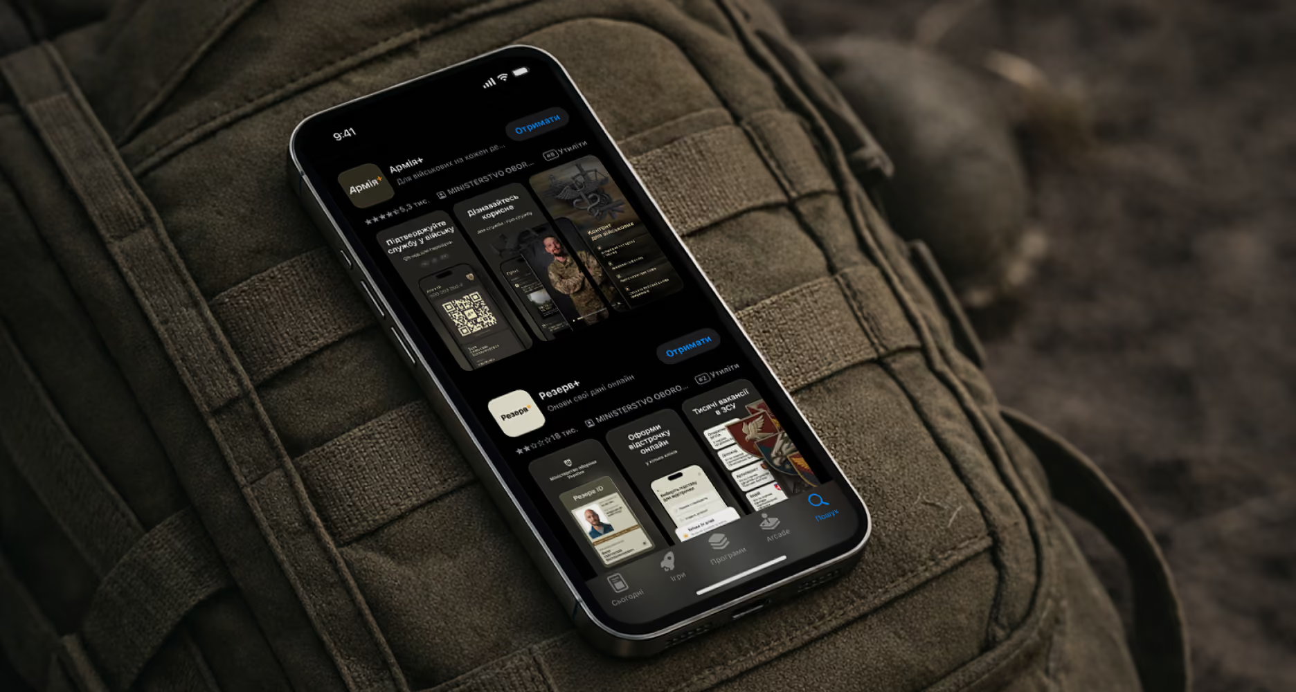
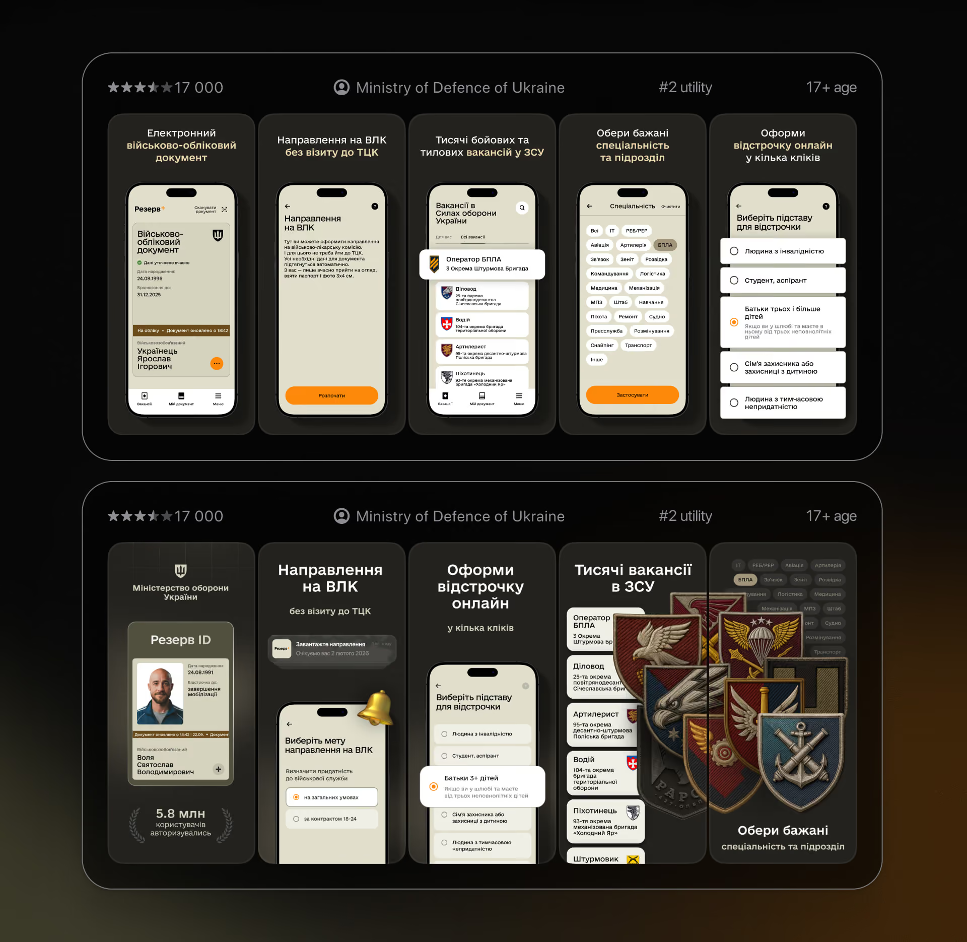
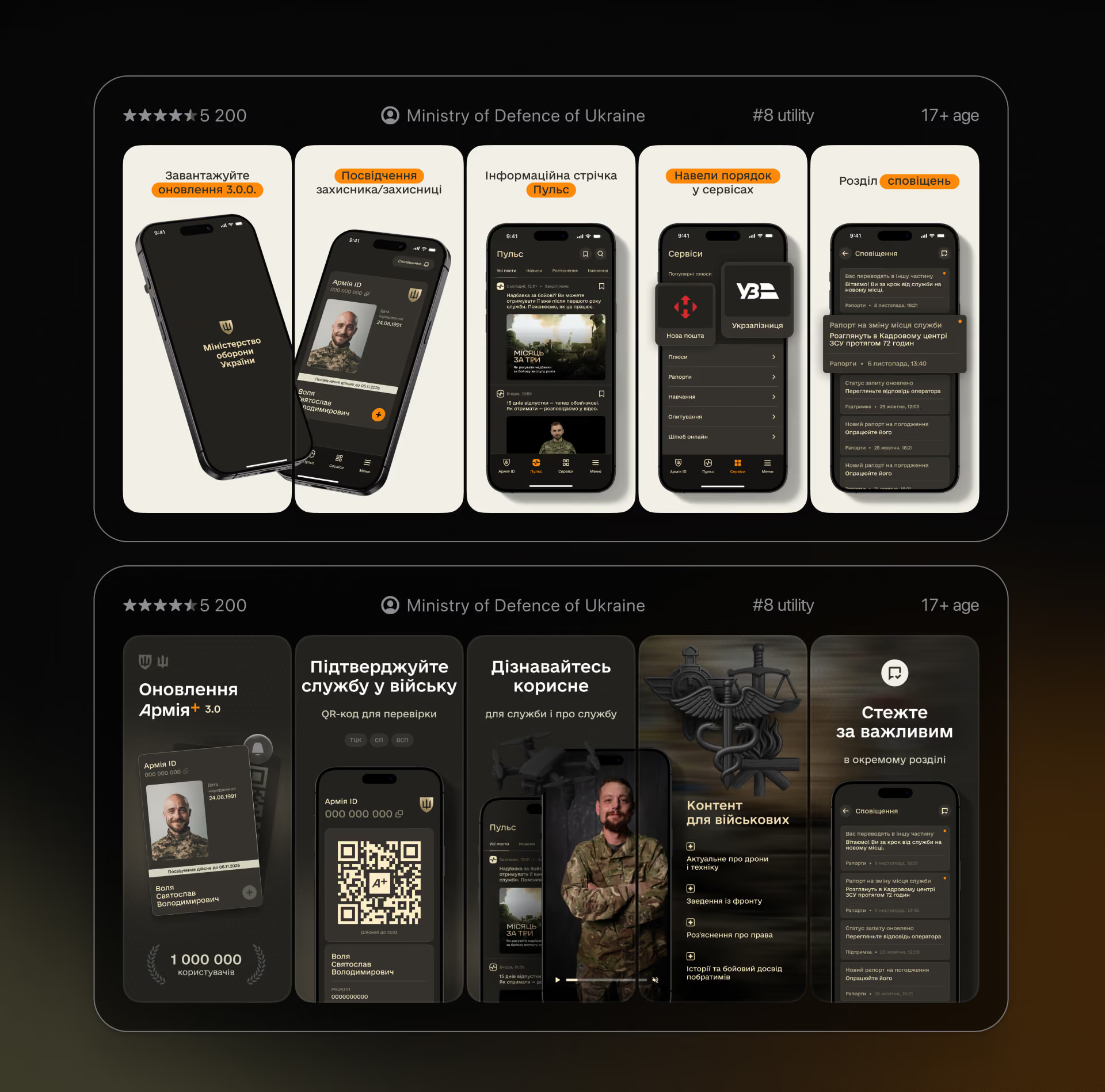
Show government apps that people are required to use in a clear and friendly way. The store pages needed to explain what each app does in a few seconds and look like one family.
Solution
Used ASO to highlight digital convenience,
clearer feature communication, and more direct interaction between the user and the state.
Impact
Helped shift the store presence from formal and purely functional to more approachable and user-oriented, with stronger emphasis on clarity, paperless processes, and real everyday value.
our role
ASO design: screenshot structure, messaging, feature selection, visual system for both apps.